Sabtu, 30 Januari 2010

Great Sand Dunes

Distance: 3 miles round trip
Elevation: 8,050 ft to 8,690 ft
Elevation Gain: 640 ft

The Great Sand Dunes. The scale is lost in this picture even with the tiny people.

A detail of the sand grains

The Great Sand Dunes in the San Luis Valley are one of Colorado's geologic wonders. They cover 30 square miles and rise to over 700 feet from the valley floor. I have never made it all the way to the "High Dune" which this post depicts, because I have always visited the dunes on my way to someplace else. Playing in the sand is hard to resist, however as the many hordes on the dunes attest.

The Medano Creek is a favorite spot for young children to plan in.

The dunes ever shifting shades of color draw people time and again.

There is no trail up the dunes, but it easy to follow the route of others. The "High Dune" is merely the highest point visible from the parking lot. It is not the highest point in the dunes. That edifice is another 1.5 miles beyond the high point.

Looking east from part ways up the dunes. That line in the middle of the picture is a string of people walking down.

Climbing along a ridge

While elevation gain is the goal of most Colorado hikers, I find that the dunes themselves and not the vistas are the best part about a visit to the park. The varying shades of brown, the clouds, and the welcome warmth (even in summer) of the sun baked crystals are a unique experience.

Looking east farther up the dunes

Sand and blue skies. What is not to love?

I have yet to visit the dunes without at least rolling down, leaping down, or pushing someone else down the hills. I have done yoga poses and crawled about in desert death-like throws. Such wanton behavior barely makes a dent in the shifting surface and is totally ignored by the numerous other adult-children absorbed by their own frolics. What is it about sand that makes people want to play? Perhaps we need a few more sand boxes in corporate America.

Following everyone else's trail

There are 7 species of insects in the dunes that live no where else, but the only large creature that can survive the harsh conditions is the Kangaroo Rat. Most of the other visitors are of the 2-legged kind.

Climbing the dunes is harder than it looks. You slip and slide and struggle upwards.

Small grasses hold the dunes in place here and there.

There are other great places to go within the Great Sand Dunes National Park, but they have their downside. To get there, one must let some of the air out of ones tires and drive along roads that are covered in sand most of the time. There is no ideal place to refill ones tires once done.
There is a small visitor's center and a large picnic ground, which was completely full the last time I visited.

The winds create abstract designs in the sand.

Coming back down and looking out into the San Luis Valley

The Great Sand Dunes were formed when a giant lake, that filled the entire San Luis Valley finally dried up, leaving large deposits of sand. Winds from the west blow the sand up against the Sangre de Cristo Mountains to the east while at the same time periodic downsloping winds have sent the sand back eastward. The juxtaposition of these two forces has piled the dunes to record breaking heights.

Everyone in Colorado needs to visits the dunes at least once in their life. Their uniqueness, their beach vibe, and their scenic beauty are worth even a short stop over.

Jumat, 29 Januari 2010

nayanthara blue film vdio - nayanthara blue film video

nayanthara blue film vdio - nayanthara blue film video


See It Here

Asin boob show - asin breast

asin hot videos

Nayanatara Hot with raviteja

Nayantara Hot Video

nayanthara hot videos simbu &nayanthara

Bhavana hot videos Bhavana Hot In Saree

BHAVANA BOOB PRESS WET

Bhavana Navel touch

bhavana hot video

kavya madhavan hot

Kamis, 28 Januari 2010

OPI Hong Kong Collection Spring 2010

My Bling Dynasty bottle broke in transit so I wasn't able to swatch it at the same time as the rest of the collection.... I'll upload it here as soon as I get a pic :)

Lots to cover here... on to the pics!


A Good Mandarin is Hard To Find. A bright summery looking orange creme. Very saturated, not a faded or pale orange by any means.


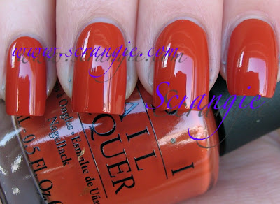
Chopsticking To My Story. This is more of a burnt orange creme. This seems like a fall-caramel-pumpkin pie color to me, definitely unexpected for spring! I rather like it. It's a little bit like Ginger Bells... I did a little comparison.


Index: Chopsticking To My Story
Middle: Ginger Bells
Ring: Out Of This World
Pinkie: OPI And Apple Pie


Dim Sum Plum. The sunlight kinda warps and washes out this color. It's really not what I'd call plum, maybe plum blossom instead? It's a purple-berry kinda magenta creme. Not totally unique but I like this version because it's cooler and goes better with my skin tone.


Hot And Spicy. Somehow I forgot to take an indoor picture of this! I'll add one when I add Bling Dynasty. Anyway, this is a light orange creme. Reminds me of shrimp. Very pretty. I love orange.


Jade Is The New Black. The star of the show. This is a very unique green. I don't have anything else in my collection quite like it. It's a very blue based dusty green. Not so dusty that it looks grey, but it is more 'faded' than 'fresh' looking. Love.


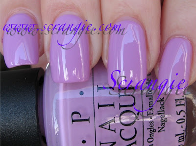
Lucky Lucky Lavender. The sun really does weird things to these violet-pinks! Anyway, this one is a pale pastel violet-pink. It says lavender, but it's more pink to me than lavender. Pink with a kiss of lavender. It's a little softer and not as stark looking as, say, Mod About You. Little bit like Essie Neo-Whimisical from the spring collection too.


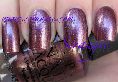
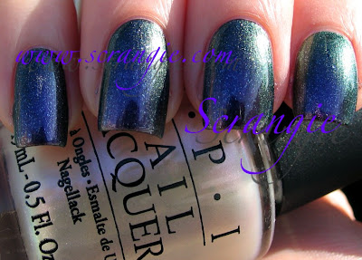
Meet Me On The Star Ferry. Shimmery warm red-purple with a little gold frost. Very complex finish- it's not straight shimmer and not straight frost. Has a few little flecks of foil mixed in. Reminds me slightly of Queen of West Web-erly from last spring. Not matches, though, just slightly similar.


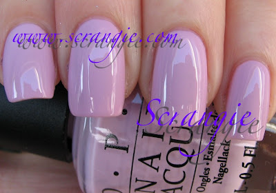
Panda-monium Pink. A cool pastel baby pink creme. It has a little bit of lilac to it, it's not straight pink. It's also dense but not as stark as some other similar 'mod' type white-pinks. Looks springy to me, like the flowers that grow on my neighbor's tree in spring.


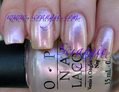
Pearl of Wisdom. Ooh! Surprise coolness. It's an iridescent/duochrome sheer shimmer shade, very cool looking. The main color is pink, but it also flashes green, purple and a little silver and gold. Looks nice alone, but it's AMAZING over black. The shimmer in this is really nice too. (This color might actually be a re-release, I'll have to see if I have the original)


Pearl of Wisdom over black. See how all the colors come out? You can see the green and pink and purple but you can also see the little flecks of shimmer scattered on the nail too.

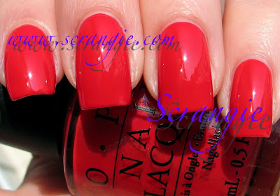
Red My Fortune Cookie. BRIGHT red creme. I think this is the kind of red I like. I'm not really drawn to medium reds or dark reds in creme or shimmer, but I love reds like this. It's bright and happy and kinda retro looking. I want to say this is a little on the warm side because it has a slight orange undertone.


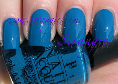
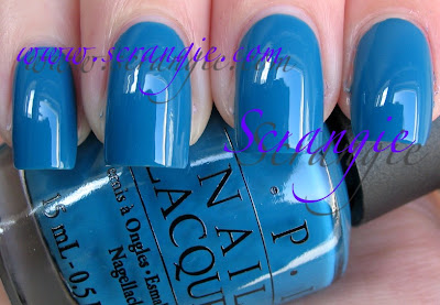
Suzi Says Feng Shui. Dusty blue! I know it looks really bright in my pictures, but it has a definite soft and faded look to it. Again, pretty unique, I can't think of another dusty blue quite like this. Love love loooooove


The formula on these was great. Consistent. A little on the thin side, but pretty standard for OPI. I had no trouble with any of them. I did two coats of all, except for Pearl of Wisdom which is three. Good opacity, no streaking, good wear. Great dry time, too. The one odd thing I noticed about these is that they smell WEIRD. They don't have a nail polish smell like I was expecting... It actually smells like Sharpie to me! Permanent marker. Very odd. The smell doesn't stick around long after it dries, but you can definitely smell it when it's wet. I wonder if they changed formula again? Hmm....


As for the theme of the collection (Hong Kong)... I don't have a clue! I don't know if these are typical Hong Kong colors or not. When I think of Hong Kong I think of red and gold, and this collection is surprisingly easy on the red! Not a bad thing, just surprising cause OPI always does lots of reds. One red and one gold in this collection. The other thing I think of when I think of Hong Kong is neon signs. Yellow, green, red, orange. I'm surprised there wasn't a yellow in this collection too! But, overall, not bad, I actually like all the colors. No duds. And this time they did a green and a blue! Big improvement over South Beach from last spring which didn't have too much color variety.

Another surprising aspect of this collection besides the amount of red is that they're almost all cremes. Only three shimmers. I like cremes so this is not a flaw to me, but it is surprising because it seems like they always do half-and-half with collections. Six cremes, six shimmers. But I'd rather have a red creme than a red shimmer and an orange creme instead of an orange shimmer... so I'm happy. There's green, there's blue, there's orange, there's a duochrome.... Pretty good for spring!


I don't know the exact release date of these, but I'll check and update when I have the date. Early-to-mid February is my guess.

(These were sent to me for review.)

Rabu, 27 Januari 2010

New drugstore awesomeness

I'm a huge Wet n Wild nail polish fan. Always have been. I noticed some new displays of Wet n Wild polish while out grocery shopping the other day and picked up these gems!


Blackmail. This is from their new line, it comes in squatty little round bottles. This shade is a black base with multi-colored glitter. Along the same lines as Sephora by OPI Never Enough Shoes and Sally Hansen Midnight in NYC, but I like this better. Why? More glitter. The glitter in the other two is too subtle for me, this one sparkles more. There's gold and red and something that looks iridescent or multicolored but it's small so I can't tell.


Blue Moon. HOLY CRAP. SO HOT. It's a dark blue shimmer with a green sheen/slight flash to it. It reminds me of my favorite blue from Jessica (Midnight Moonlight!), except this is 99 cents. It's rich and beautiful and not so dark that it looks black. Right on, Wet n Wild!

Night Prowl. Black base with hot pink/magenta glitter. Love at first sight. This is a bit like Petites... something... Amethyst something... I can't remember the name. The color of the glitter is rich and bright, not faded and silvery and it really stands out against the dense black. No glitter gets lost in the black base! So awesome.

Formula on these is on par with the rest of Wet n Wild's polishes- perfect. Pretty opaque, all looked good at two coats but I did three cause I'm like that. Good dry time. Excellent price tag.

The new squatty-bottle Wet n Wild line had a dusty blackberry/purple/mauve color that looked cool but I didn't grab that one. The others were mostly pinks and berries, but there were a few interesting ones sprinkled in. The Wild Shine line had a handful of new colors too, one was a glitter that looked like China Glaze Snow Globe, one was a lavender duochromey color and one was a silver? Oh, and two pinks.

Love me some Wet n Wild...

Fox Squirrel: My winter haiku

Snow sticks to the tree
North wind blows cold and dreary
Long line at the travel store

Selasa, 26 Januari 2010

Essie Art Of Spring Collection Spring 2010


I really like this collection... I was not wowed by the promo pictures initially (except for Lilacism, that one was great from the start!), but I'm so glad I gave them a chance and tried them on my nails.


Lilacism. This is slightly less blue in real life, but not by much. Maybe half a shade to one shade less blue. I'm wearing it right now and it's definitely on the blue side of lilac. This is sooooooooo pretty. It's creamy and stark and obvious, but not so stark that it's like white-out. It's refreshing. This is two coats.


Neo-Whimsical. This is slightly reminiscent of one of my favorite Essies- Guchi Muchi Puchi. It's a light milky pink with a splash of violet to it. Looks more purply in some lights, more pink in others. Three coats here.


Pop Art Pink. A really light milky jelly pastel pink. It's like a pink version of Marshmallow. This one is pretty versatile because at one coat it's a sheer-clear pink gloss, barely any color on the nail at all, at two coats it's a semi-sheer milky natural looking pink and at three coats (pictured here) it's a nice jelly milky pink. So, if french manicures are your thing, this would make a good base color. I like it at three coats, myself. It looks squishy and cute.

Red Nouveau. This is just... Perfection. The formula on this one was like butter. Serious pigment to this polish and it was like my nails painted themselves. It's a fairly opaque but still a bit translucent bright red on the first coat (and zero streaking so you could get away with just one if you don't mind visible nail line) and a slightly darker opaque glossy cherry red on the second coat. I love the brightness and the vibrancy of this shade. It's retro-glamorous and it just screams Valentine's day to me.

Tart Deco. Kind of an... orangey... salmon-y... coral kinda color? Creamy orange coral? Maybe a little peachy? Hard for me to describe. Soft peachy pastel cantaloupe. Very dense and milky looking. This is only two coats, I anticipated it needing more but it was surprisingly opaque and streakless.


Van D'Go. Kinda like MAC Seasonal Peach's baby sister. It's peachy and pinkish, milky and soft but still has that kind of stand-out bold creme finish that I like about Seasonal Peach. This is a lot softer, less vibrant of a shade and pinker. Two coats of this one, too.


The formula on these was all over the place. Very inconsistent. Van D'Go and Tart Deco were very opaque and thick, maybe even a little goopy but not unmanagable. Lilacism and Neo-Whimsical were on the watery side. Pop Art pink was about average, not too thick, not too thin, and Red Nouveau was absolutely flawlessly perfect. I'm surprised the formula varied so much within one collection! The drying time on these is excellent, even at three coats. Also, the wear seems pretty good, as I've been wearing Lilacism for two whole days now and there's not a chip or crack in sight even after heavy cleaning without gloves, excessive typing and obsessive hand-washing.

Overall... yeah... I can't deny it. I love this collection. It is so not 'me' at ALL... But just looking at these gives me a cheerful almost romantic feeling. They make me happy. This winter has seemed unusually dark for me and on top of that I am almost always wearing very dark vampy colors.... So looking at these brightens my day a little. Kinda like China Glaze Up & Away. Lighthearted.

What I think really draws me to these is that they remind me of my favorite Valentine's Day candy. You know, those little pastel colored hearts that everyone else seems to hate, but I love? They taste kinda like flavored chalk and have cutesy and often nonsensical sayings printed on them?

Last year for Valentine's Day Mr. Scrangie got me some really great ones... Instead of the usuall "call me" or "be mine" on them, they have more interesting phrases...


I think my favorite one is the "PWNED! MEH." one. Some of the other ones say things like, "6 wives okay?" "I been creepin", "parole is up!", "Up yer meds", Prenup okay?" and stuff like that... LOVE THEM.

Which also reminds me of being in high school and writing my own phrases on them with a Uni-Ball pen... "Your mom"... "5u1c1d3 15 y0ur 0n1y 0p710n".... "Pics now"...

Woo! Random candy tangent! Although... I think Red Nouveau is more Red Hots than chalk-hearts. And the mint green is missing! I bet Mint Candy Apple would fit the bill.... Oh, and the yellow! I don't know what color the yellow should be... Barbuda Banana?

(These were sent to me for review.)

Pengikut